PARIS BLOG

HOME > Blog

Blog

Don't Miss Property Update

From Paris Property

Christmas In A Digital Wonderland

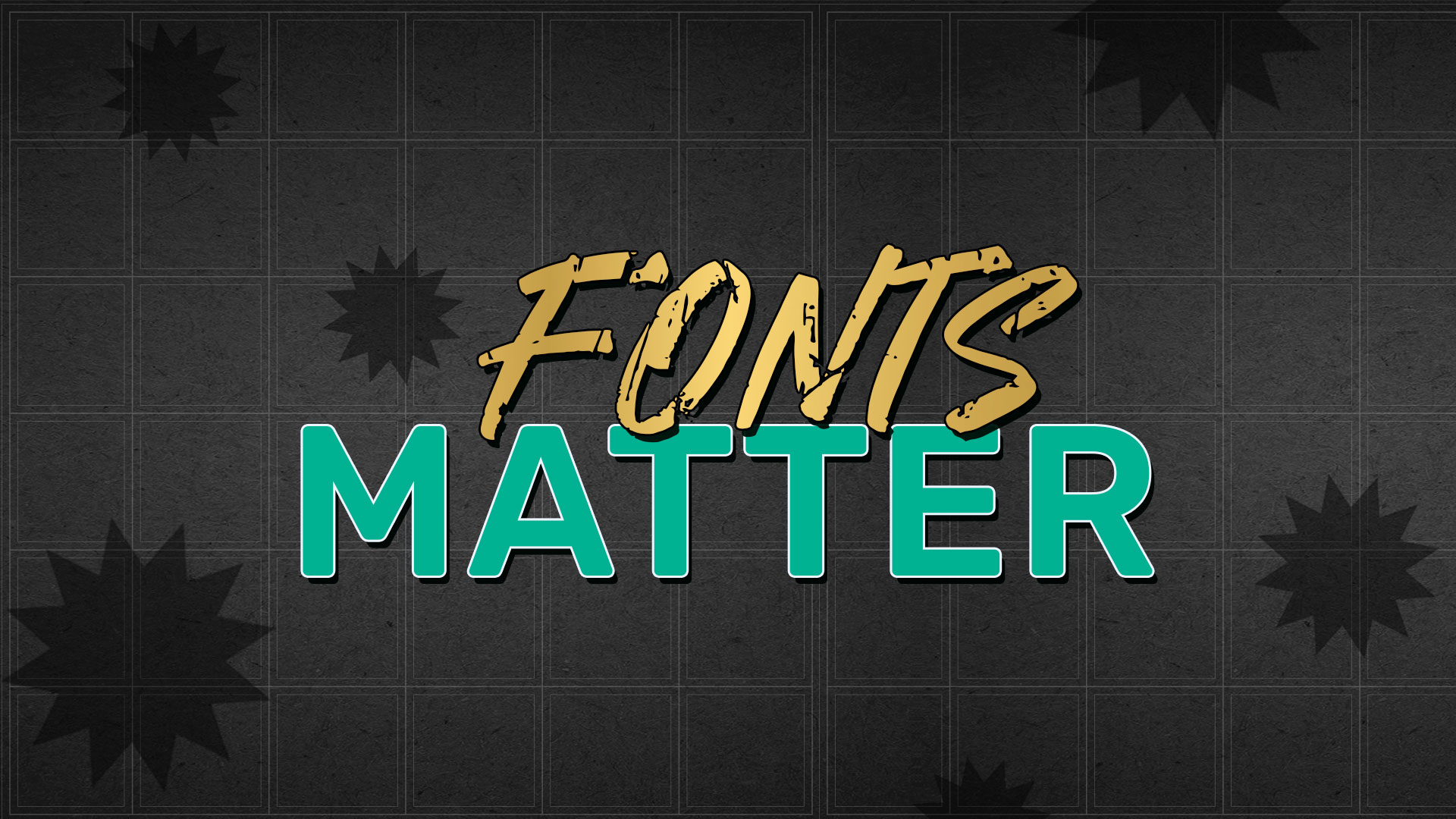
As the holiday season unfolds, Smart Magic is excited to be your guiding light in assisting your brand in spreading warmth, joy, and festive cheer throughout your online presence with the enchanting power of design. In this blog, we take a journey through the magical world of Christmas, and how the team kept this festive holiday to create collateral for our clients. delving into the details and drawing inspiration from iconic brands such as Starbucks and Coca-Cola, exploring the vibrant Christmas colour palette, and showcasing the dance of holiday-inspired fonts that together create a digital wonderland for your target audience. A Nutcrackers Mood Boards At Smart Magic, the graphic design process begins with our guiding North Star—the mood board. More than just a visual collage, mood boards serve as a compass, ensuring that your designs are not only visually stunning but also aligned with your goals and resonate with your target audience. Before delving into the intricacies of design, our team meticulously crafts mood boards that encapsulate the very essence of Christmas – a celebration of joy, warmth, and togetherness. Explore with us as we unveil our festive mood board—a captivating journey through twinkling lights, cosy fireplaces, and beautifully adorned Christmas trees. This curated collection captures the timeless charm of classic ornaments, the rich hues of seasonal decorations, and the delectable spread of holiday treats. Whether you’re seeking inspiration for DIY websites, stylish social media festive packaging, or running offers for performance marketing, our mood boards are a treasure trove of ideas to make this season truly special. Inspiration from Starbucks Drawing inspiration from renowned brands is integral and this year, Starbucks’ Christmas cup collection has ignited our creativity. The vibrant holiday reds, greens, and mood-boosting magenta, adorned with sparkles, align perfectly with our vision of spreading joy. The theme of “Share the Joy” resonates deeply, reminding us that the holiday season is about shared experiences and togetherness. Unveiling Christmas Colours The classic red and green Christmas colour palette carries a rich history rooted in symbolism, religion, and popular culture. From ancient celebrations to the influence of Coca-Cola’s iconic Santa Claus ads, these colours have become synonymous with the holiday season. Understanding the depth of these colours, it brings a touch of tradition and history to our designs, infusing them with the timeless charm of Christmas. Beyond red and green, we explore additional Christmas colours and their meanings – white representing purity, gold and silver symbolising the gifts to Jesus, and blue associated with the winter landscape. Our design palette goes beyond the ordinary, creating a visually stunning array that captures the diversity and magic of the season. Fonts that Dance with the Holidays Typography plays a pivotal role in conveying the festive spirit, and at Smart Magic, we’ve curated a collection of Christmas and holiday-inspired fonts designed to make your digital presence truly gift-worthy. From the playful swirls of “One Starry Night” to the lace-like elegance of “Metro Retro NF” and the nostalgic charm of “Sentinel,” these fonts bring your messages to life with the energy and warmth of the season. Your Digital Wonderland Feeling the pressure to create a stellar holiday design? Fear not! Graphic design help has arrived. From mood boards that set the tone to colour palettes steeped in tradition, inspired by iconic brands like Starbucks, and fonts that dance with the holidays – our designs are not just pixels on a screen. They are crafted with the warmth and care that defines the holiday season. ‘Tis the season to share the joy, and through design magic, your audience will feel the excitement and warmth of the holidays. Designs are not mere pixels on a screen; they craft moments of joy, memories, and a digital wonderland that sparkles with the magic of the season. Conclusion In conclusion, let the magic of design be your creative companion this Christmas. These designs are not mere pixels on a screen; they craft moments of joy, memories, and a digital wonderland that sparkles with the magic of the season. From our design family to yours, may your holidays be filled with warmth, laughter, and the enchantment of beautifully crafted designs that stand the test of time. Warm wishes and Happy Holidays!

Read More »

Brand V/s Branding 

In the intricate tapestry of business, the terms “brand” and “branding” often intertwine, yet their distinctions play pivotal roles in shaping a company’s identity and success.  Let’s embark on a journey to understand these elements and their unique contributions to the business ecosystem. Brand  At its core, a brand is not just a business; it’s an entity with a defined mission, purpose, and a rich narrative. Beyond the tangible products or services it offers, a brand consists of emotions, intimately connected to the individuals who brought the company into existence.  A brand is a dynamic force that goes beyond transactional exchanges, seeking to establish lasting connections with its customers. It’s an emotional anchor that transforms a commodity into a cherished experience, fostering loyalty and trust in the hearts of consumers. Branding  Branding is multifaceted, incorporating marketing and communication strategies to amplify its impact. It serves as the vehicle through which a brand communicates its story to a wider audience.  This involves not only the creation of visually appealing logos but also orchestrating advertising campaigns and implementing digital marketing strategies. Here is an example, to help you understand.  Think of your own personality. Do you consider yourself an outgoing person? If so, that may be a part of your personality (brand). Now think of the things you do that contribute to being outgoing (branding) such as communicating with people, picking out your outfit that makes you stand out, being aware of good conversation starters.  If you only do these things once, it doesn’t make you an outgoing person. They must be consistent habits to become a part of your personality. In the same way, the things you do to augment your brand must be consistent to be accepted as your business personality. This brings us to our next segment  Brand positioning  Brand positioning is the distinct value forming a strategic marketing approach to define its identity and articulate its unique value proposition. This strategy aims to communicate why customers should choose the brand over alternatives.  Companies utilise brand positioning to deliberately shape how they are perceived by their audiences, motivating connections between the brand and its core value proposition. This intentional effort is crucial for establishing a lasting and positive association in the minds of customers. Let’s look at a case study The Absolut Brand  Absolut, a Swedish vodka brand founded by Lars Olsson Smith in 1879, is anchored in a set of core values that have defined its legacy of excellence and innovation. At the heart of Absolut’s ethos is an unwavering commitment to quality and purity, epitomised by Lars Olsson Smith’s groundbreaking continuous distillation method, known as rectification. This method not only revolutionised vodka production but also became the cornerstone of Absolut’s dedication to crafting a purer and smoother form of alcohol. The brand’s relentless pursuit of perfection is complemented by a spirit of innovation, as evidenced by Lars Olsson Smith’s forward-thinking approach, which continues to inspire the brand’s commitment to pushing boundaries and setting industry standards. Absolut’s core values reflect a harmonious blend of tradition, quality, and innovation, shaping its identity as a trailblazer in the world of premium vodka. The Branding Concept Absolut, originally was introduced as “Absolut Rent Brännvin” and marked the inception of a brand deeply rooted in a commitment to purity and quality.  The Absolut Vodka logo is a distinctive and iconic design that has become synonymous with the brand. The logo has undergone subtle variations over the years, but certain elements have remained consistent. The two words “Absolut” and “Vodka” are written in bold lettering in the iconic VIVID BLUE COLOR, to symbolise the clarity and purity. A big DOT at the end in bold to make a strong statement   In the centre of the two words is the origin of vodka which is a pride factor for the brand. It’s written in a classic delicate cursive font.  Brand Positioning Absolut Vodka strategically sets itself apart from competitors in the vodka market through a diverse approach that encompasses distinctive branding, innovative marketing strategies, and unique product offerings.  At the core of this strategy is a commitment to creativity and storytelling evident in renowned campaigns such as the “Absolut Perfection” and “In An Absolute World” series. These campaigns transcend traditional product advertising, weaving narratives that forge personal and emotional connections with consumers. Furthermore, Absolut Vodka’s differentiation is amplified through its history of dynamic collaborations with artists, designers, and cultural influencers. These creative partnerships result in limited-edition bottles and bespoke marketing initiatives, solidifying the brand’s identity as a cultural and creative icon.  In an industry where branding and artistic collaborations are pivotal differentiators, Absolut Vodka’s strategic emphasis on these ventures stands out, fostering a unique and compelling image. In essence, Absolut Vodka’s strategic differentiation encompasses not only its commitment to quality and innovation but also its ability to craft narratives that resonate with consumers, coupled with impactful collaborations that elevate the brand into a cultural and creative force within the competitive vodka market. Conclusion  In the exploration of Absolut Vodka’s journey, we witness a compelling embodiment of the distinct roles played by Brand, Branding, and Brand Positioning in shaping a brand’s identity. Absolut’s brand is not merely a label for its vodka; it’s a living entity with a rich history, rooted in a set of core values that transcend the transactional nature of its products. This essence forms the very soul of the brand, fostering emotional connections with consumers and transforming the act of consuming vodka into an experience deeply intertwined with tradition, quality, and innovation. Absolut Vodka’s brand, therefore, serves as the foundational compass that guides its overarching narrative and purpose, setting the stage for the interplay of branding elements that amplify its presence in the market. The branding strategies employed by Absolut further illustrate the multifaceted nature of creating a brand narrative. From the iconic blue logo to innovative marketing campaigns, the visual and communicative elements of branding serve as the outward expressions of the brand’s core values. Consistency in these branding

Read More »

Mastering Expressive Typography

Introduction: The Power of Expressive Typography In the realm of design, expressive typography stands as a dynamic approach that transcends the conventional boundaries of text representation. It doesn’t merely convey information; it strives to evoke emotions, communicate moods, and emphasise on messages through the strategic use of typefaces, fonts, colours, layout, and other typographic elements.  This blog will guide you on expressive typography, from its significance to foundational principles for beginners, design principles, and the dynamic relationship between colour and text.  Significance of Expressive Typography in Design Expressive typography adds a layer of creativity to design, going beyond the traditional focus on clarity and legibility. Its ability to engage and captivate audiences on a visual and emotional level sets it apart. By creatively manipulating the visual appearance of text, designers can infuse personality into an artwork, convey brand identity, and inflict specific feelings. This approach adds depth and nuance to the visual language, contributing to the overall aesthetic and communicative power of a design.  Typography Fundamentals for Beginners It is extremely important to keep in mind the following points when designing expressive typography. What is the difference between a typeface and font? A typeface is a consistent design of characters, encompassing the overall style, shape, and appearance of the characters. On the other hand, a font refers to a specific instance of a typeface, encompassing its style, size, and weight. In essence, a typeface is the design, while a font is a particular implementation of that design with specific attributes.  What’s the difference between serif and sans serif font style?  Serif typefaces feature small decorative strokes on characters, conveying a more formal tone. It is traditional. In contrast, sans-serif typefaces lack these strokes, presenting a modern and clean aesthetic.  Why is Alignment so important?  Master alignment options such as left, centre, right, and justified to achieve a clean and organised appearance in text layouts. Explore emphasis techniques through variations like bold, italics, and underline to guide the reader’s focus and create visual hierarchy. Balancing alignment and emphasis ensures effective communication and enhances the overall structure and readability of typographic designs. Legibility and Readability: is it vital?  Ensure text is visually balanced and easily understood by focusing on legibility, which pertains to the clarity of individual characters. Readability considers how words, phrases, and blocks of text can be easily comprehended. Both legibility and readability are critical aspects of effective typographic design, contributing to the overall accessibility and user experience. Responsive typography further ensures optimal reading experiences across various screen sizes and devices. The Dynamic Relationship Between Colour and Typography Explore the dynamic interplay between colour and typography to significantly influence the visual impact and emotional resonance of a design. Beyond choosing black or white text, leverage a spectrum of colours to evoke specific moods, enhance branding, and guide viewer attention. Warm colours like reds and oranges can convey energy, while cool colours such as blues and greens evoke calmness. Carefully selecting colour combinations enhances readability, creates hierarchy, and ensures that text stands out effectively. This strategic integration of colour into typography goes beyond aesthetics, playing a crucial role in accessibility, user experience, and brand identity. Meet Risa Rodel  Meet Risa Rodel, a dedicated typographer whose passion for the field is evident in her diverse portfolio. Specialising in typographic design, Risa has lent her creative touch to projects ranging from book covers and magazine spreads to advertising campaigns, promotional posters, and merchandising items. Beyond her typographic endeavours, Risa’s days off are filled with exploration as she enjoys visiting new cities, indulging in reading, and embracing her inner nerd through binge-watching television shows. This combination of professional expertise and personal interests underscores the dynamic and multifaceted nature of Risa’s creative journey in the world of typography. Pushing Creative Boundaries: The Art of Expression Every typographic choice is not just a design decision but a brushstroke in the creation of a unique and impactful form of visual communication. Embrace the art of expression by daring to experiment, innovate, and redefine the limits of typographic design. In this pursuit, discover the transformative power of breaking conventions and letting creativity flourish, resulting in designs that resonate on a profound and individual level. In a recent project, our team undertook a creative endeavour for Bachelorr’s, a dynamic fast-food restaurant. Our primary goal was to create captivating typography that would spell out the distinctive identity of Bachelorr’s in a visually engaging manner. Beyond the realm of conventional designs, we aimed to infuse the brand’s essence into the very letters that form its name Conclusion: Unleashing the Potential of Expressive Typography Embark on a captivating creative journey where expressive typography transforms into a powerful tool for conveying emotions, messages, and moods. This guide is your compass, navigating from the mastery of fundamentals to the exploration of the dynamic interplay of colour. Equip yourself with the skills to craft visually compelling designs that imprint a lasting impression. As you traverse this typographic landscape, remember to keep experimenting, stay inspired, and let expressive typography be your limitless canvas for exploring endless creative possibilities. The journey is yours to shape, and the possibilities are boundless.

Read More »

The Art of Subliminal Logos

Subliminal elements in a logo are subtle design features, symbols, or messages intentionally hidden within the logo’s design, not immediately evident upon initial inspection. These concealed elements are inserted to convey a secondary or deeper meaning. What is a subliminal in a logo? A common question asked by people who are looking to give their brand an identity. Subliminal elements in a logo are hidden as subtle design features, symbols, or messages that are not immediately obvious to the viewer at first glance. These elements are intentionally incorporated into the logo design to convey a secondary meaning or message to those who pay close attention or analyze the logo more deeply. The history of subliminal messaging in logos dates back to the mid-20th century when it gained fame in the 1950s and 1960s amid concerns that advertisers were employing hidden messages to influence consumer behavior. These suspicions led to various studies and investigations into the phenomenon. The effectiveness of subliminal messages in logos and advertising remains a topic of debate. While some studies have suggested that subliminal messages may have a limited impact on behaviour or perception, the results are inconclusive, and opinions on their influence differ. How do we create them? Designers employ various techniques to create subliminal messages in logos. Negative space, which refers to the area surrounding and between the main elements of an image, is cleverly manipulated to form shapes and symbols that convey hidden messages or create visual intrigue within the logo. Advertisers employ subliminal messages as a psychological marketing technique to subtly influence consumer behaviour and perception. These concealed messages aim to shape consumer choices, decisions, and brand preferences without the viewer consciously realizing it. They can be utilized to promote a product, encourage brand loyalty, or boost sales. Lets look at some of notable logos that have subliminal messaging FedEx: The FedEx logo is famous for the hidden arrow created by the negative space between the “E” and “x.” This arrow symbolises speed and forward motion. Amazon: The Amazon logo features a smile that goes from the letter “a” to “z,” subtly indicating that they have everything from A to Z. Toblerone: The Toblerone logo contains a hidden bear in the mountain design, representing the Swiss origins of the chocolate brand. The bear is associated with the city of Bern. Baskin-Robbins: The Baskin-Robbins logo has the number “31” incorporated into the letter “B” and “R,” signifying their famous 31 flavors of ice cream. Toyota: Some interpretations suggest that the three ovals in the Toyota logo represent the company’s vision to unite the hearts of its customers and the company itself. Unilever: The Unilever logo is known for its hidden symbols representing different aspects of the company’s diverse product range, including a heart (for love), a bird (for freedom), and more. Gillete — Look closely at the “G” and the “i” in this logo and you’ll notice the razor-sharp cuts into the text, which represents the shaving brand’s main product. Beats — The “b” in the beats logo is mean to look like someone wearing headphones. LG — The electronics company managed to create a winky face out of ‘L’ and ‘G”.10.  Hyundai: The 10. Hyundai: logo symbolises a handshake between the company and its customers, with two stylized “H’s.” In the realm of logo design, the art of negative space is often underestimated but holds incredible potential. It adds depth, intrigue, and memorability to a brand’s visual identity. Cleverly using negative space can transform a logo into more than just an image; it becomes a story, a conversation starter, and a lasting memory in the minds of consumers. Therefore, when designing or analysing logos, paying close attention to the spaces in between may unveil the most about a brand’s identity.

Read More »

The Evolution of Bollywood Movie Posters: A Visual Journey

Introduction: The movie industry is one of the fastest-growing sectors worldwide, and poster design plays a pivotal role in marketing films and connecting with the audience. Indian cinema, with its diverse genres and regional influences, has witnessed a remarkable transformation in movie poster design, mirroring the evolving dynamics of both cinema and graphic art. Let’s take a trip down memory lane to explore the captivating evolution of Bollywood posters. 1950’s – The Golden Era: In the early days of Indian cinema, movie posters were intricately hand-painted with vibrant colors. Bold typography and dramatic poses of actors created eye-catching designs that set the stage for the film’s narrative. An iconic example is the poster for “Shree 420,” featuring Nargis Dutt and Raj Kapoor. The gripping red title beautifully conveyed love and action. 1970’s-1980’s – The Era of Larger-Than-Life: Bollywood transitioned from hand-painted posters to a more photographic approach. Posters aimed to portray film stars in a larger-than-life manner. Smart taglines and bold typography became essential elements in poster design. “Sholay” and “Don” are notable examples with action-packed visuals and stylized fonts, setting the mood for these iconic films. 1990’s – Embracing Contemporary Trends: As technology advanced, the 90s brought a shift towards more contemporary and graphic design-oriented posters. Graffiti-style fonts and photography remained prominent. Films like “Andaaz Apna Apna” and “Dilwale Dulhania Le Jayenge” incorporated vibrant colors, quirky typography, and dramatic poses to tell their stories. 2000 – The Millennial Shift: The 2000s marked a significant shift as Bollywood posters adopted a minimalistic and focused design approach. These posters emphasized star power and catchy fonts against uncluttered backgrounds. “Kuch Kuch Hota Hai” is a prime example with its simplicity, featuring the cast against a white background with neon blue typography. 2010 – Embracing Contemporary Design Elements: This decade saw Bollywood posters embracing modern design elements and digital innovations. Clean lines, high-resolution images, and sleek typography became the norm. Special effects and digital artwork enhanced posters, while social media integration encouraged online engagement. Films like “Dabangg” and “3 Idiots” showcased these design trends. 2020 – The OTT Era: With the pandemic pushing the entertainment industry towards OTT platforms, Bollywood posters continued their minimalistic look. Digital tools allowed for special effects and countdowns to build anticipation. Social media engagement became a standard practice, with users encouraged to share their content and participate in challenges. “Ludo” exemplifies this trend with its colorful, playful design. Present Day – Advanced and Detailed: Today, Bollywood posters are more advanced and detailed, with a focus on concept and clarity. Special effects enhance the quality of designs, and some films even have separate posters for their song releases. The integration of technology and the rise in movie production have ushered in a new era of poster design. Conclusion: In conclusion, the evolution of Bollywood poster design has been a captivating journey, reflecting changing artistic trends, technological advancements, and evolving audience preferences. From the colorful and hand-painted posters of the past to the modern, digitally enhanced designs of recent years, Bollywood movie posters continue to play a crucial role in generating interest and excitement for films.

Read More »

Fonts Matter! Choose Wisely

In the world of design and communication, choosing the right font is a crucial decision that can make or break the effectiveness of your message. Fonts are more than just letters; they convey emotions, personality, and style. Whether you’re creating a website, designing a logo, or crafting a document, here’s a comprehensive guide on how to choose the right font. What are Fonts? Fonts are collections of characters which includes letters, numbers, symbols, and special characters, designed with a consistent style and size for use in printed or digital text. They are essential for conveying visual information through typography and play a crucial role in shaping the appearance and readability of written content. How does fonts help a brand? Fonts serve the purpose of infusing personality into your brand name, enhancing the visual appeal of your design, and effectively conveying your core message to attract your audience. If your audience can’t instantly recognize and engage with the text in your marketing graphics, they are unlikely to invest the effort in deciphering it. Therefore, the selection of legible fonts is of utmost importance. While body text fonts may not possess the same prominence as headers, they still need to maintain readability, even from a distance and at a quick glance. The important Key factors Functionality: The functionality of a typeface varies depending on its size and purpose. While display fonts can be stunning in larger sizes, they may lose legibility when scaled down to any size. Versatility: Designers often seek versatile fonts to ensure consistent and effective communication in various projects, from print materials to digital content and beyond. These fonts can seamlessly transition between different design applications, making them valuable tools for creating cohesive and impactful visual identities. Body Text Legibility: While headers and larger text may grab attention, don’t neglect the legibility of body text. Even smaller text should be designed to be easily read at a glance, especially in marketing materials where you want to get your message across efficiently. Font Thickness: the visual thickness or heaviness of the characters in a typeface. Fonts come in various weight options, which can range from very thin to extremely bold. Font weight is an essential design element that can convey different emotions, create emphasis, and affect the overall aesthetic of text. Types of Font styles? When categorizing fonts, they are often grouped into three major categories: serif fonts, sans-serif fonts, and script fonts. Each category has its own distinctive characteristics and is suited for different design purposes Serif Fonts Serif fonts are characterized by the small decorative strokes or “serifs” at the ends of characters. They are often considered more traditional and formal in appearance. Serif fonts are commonly used in print materials such as books, newspapers, and magazines. Examples of serif fonts include Times New Roman, Garamond, Baskerville Sans-Serif Fonts: Sans-serif fonts do not have the decorative serifs at the ends of characters. They are known for their clean, modern, and minimalist appearance. Sans-serif fonts are popular for digital and web design, as well as in user interfaces (UI) and signage. Examples of sans-serif fonts include Helvetica, Futura, Gotham Script Fonts: Script fonts mimic handwriting or calligraphy and have a flowing, cursive style. They can range from formal and elegant scripts to more casual and playful styles. Script fonts are often used for special occasions, invitations, and decorative elements. Examples of script fonts include Cookie, Rowdex and SignPainter. Licensing and Accessibility Lastly, be aware of licensing restrictions when using fonts, especially for commercial projects. Always respect the terms and conditions set by font designers and foundries. Additionally, consider accessibility. Use fonts that are legible for all audiences, including those with visual impairments. Make sure there’s enough contrast between text and background colors and provide alternatives for important information. Conclusion: In conclusion, choosing the right font is a critical aspect of effective design and communication. By understanding your purpose, exploring font categories, considering pairings, testing, and being mindful of licensing and accessibility, you can enhance the impact of your message and create visually appealing designs that resonate with your audience. So, go ahead, choose your fonts wisely, and let your creativity flow!

Read More »

Inquisitive about Infographics?

An infographic visually represents complex data. It is a break up of concepts, ideas and data that is turned into visually digestible chunks, this makes it easier for the target audiences to understand difficult topics. Most of the information is based on facts done by various methods of research. Let’s dive into it further The inception of infographics can be traced back to ancient times when humans used visual symbols and drawings to convey information. Egyptian pictograms were one of the earliest forms of visual communication. These pictograms were simple drawings or symbols that represented objects, concepts, or ideas. They were often inscribed on walls, pottery, and other surfaces which included religious, administrative, and everyday communication. No doubt the modern concept of infographics is a fusion of graphic design and storytelling. It gained prominence in the mid-20th century and underwent transformative changes, marking a pivotal era in evolution. During this era, there were a lot of artistic movements, that were inspired by technological advancements. One of the major changes that took place was the contemporary impact. It reshaped design principles to be characterised by simplicity, functionality, and a focus on form and function. Clean lines, minimalism, and grid-based layouts were common features. Why do we need infographics? Infographics are a valuable tool for many reasons. They serve multiple purposes and offer numerous benefits across different fields. Users are naturally drawn to visuals and instruments like colour, imagery and design elements to capture attention which keeps them engaged. Textual information is a mundane way to present data. Readers often need to exert more cognitive effort to understand and retain the information. It leads to mental fatigue and lowers the bar of information retention. How do infographics help Brands? Infographics can offer numerous advantages to brands, aiding them in various aspects of their communication and marketing strategies. Infographics are highly engaging due to their visual nature. They attract and retain the audience’s attention more effectively than plain text. Creative and well-designed infographics are shareable content. When audiences find infographics valuable and informative, they are more likely to share them on social media platforms, increasing the brand’s visibility and reach. Brands can use infographics to convey quick tips, statistics, or other relevant information Sharing infographics on a brand’s website can increase traffic as well. Informative and visually appealing infographics can attract visitors who are interested in the content which will lead them to improve the website’s SEO. Which will result in higher search engine rankings and increased organic traffic. Brands can strategically place CTAs within their infographics to guide viewers toward specific actions, such as signing up for newsletters, visiting the website, or making a purchase. In essence, infographics offer a versatile tool for brands to effectively communicate with their audience, foster engagement, and establish themselves as a valuable source of information within their respective industries. What are the types of Infographics that one can create? Statistical Infographics: Also known as data visualizations, these infographics use graphs, charts, and diagrams to present statistical data in a visually appealing way. Bar graphs, pie charts, line charts, and scatter plots are often used to showcase trends, comparisons, and correlations. Informational Infographics: These are used to explain a process, concept, or idea. They often use a combination of text and visuals to guide the viewer through a step-by-step explanation. DIY, tutorials, and explainer graphics fall into this category. Timeline Infographics: Timeline infographics visually depict the chronological order of events. They’re useful for presenting historical information, project timelines, or the evolution of a product or industry. Comparison Infographics: These infographics are designed to highlight differences or similarities between two or more subjects. They can use side-by-side comparisons, tables, or other visual elements to illustrate contrasts. Hierarchical Infographics: Also called pyramid infographics, these represent information in a hierarchical structure, often with the most important or broadest point at the top, followed by supporting details in descending order. Process Infographics: These infographics detail a step-by-step process, workflow, or procedure. They’re commonly used to explain complex processes in a simplified manner. Geographic Infographics: Geographic infographics use maps, graphs, and other visual elements to convey information related to geographical locations, such as population distribution, regional trends, or demographic data. In Conclusion Their role in the digital age is indispensable. Brands harness their visual allure to captivate attention, drive engagement, and enhance brand awareness. By presenting complex information through a harmonious blend of visuals and succinct text, infographics transcend language barriers and cognitive limitations. The fusion of design artistry and storytelling prowess has birthed a medium that not only captivates but educates, engages, and empowers. Infographics excel at distilling intricate data, processes, and ideas into visually digestible fragments, making them accessible to diverse audiences. As digital realms expand, so does the versatility of infographics. From statistical data and timelines to educational content and interactive experiences, infographics adapt to the information they bear, offering a plethora of formats to cater to diverse communication needs.

Read More »

CURIOUS HOW COLOUR IMPACTS BRANDING?

Colours adorn our world and infuse it with feelings. Each hue carries a distinct energy, a unique vibe that resonates with users on many levels. Colours can evoke emotions, convey information, and play a crucial role in design, art, and communication. Primary colours refer to a set of foundation colours that are used as building blocks for creating a wide range of other colours through mixing. In traditional colour theory, the primary colours are red, blue, and yellow. The study of colours is known as colour theory, and it explores the relationships between different colours and their effects on the viewer. Let’s Understand The Phycology Colours communicate through a universal language that surpasses linguistic boundaries. This profound impact of colour has led businesses to harness its potential in their branding strategies. For Instance: ENERGETIC RED The fiery intensity of red ignites the spirit and commands attention. From the passionate crimson of a rose to the vibrant energy of a traffic light, reds exude confidence, power, and vitality. It is a colour that inspires action that evokes strong emotions with love, excitement, or urgency. Coke- The red colour is a distinctive shade of red that has become associated with the Coca-Cola brand. This specific red tone is crucial to Coca-Cola’s visual identity and brand positioning. The colour is instantly recognisable and awakens a sense of energy, excitement, and nostalgia. This iconic red has transcended its role as a mere colour and has transformed into a symbol of the brand’s history, values, and global recognition. TRUSTING BLUE: The calmness of blue speaks volumes. It’s a soothing and peaceful colour that evokes feelings of dependability trust and reality. In some contexts, blue is associated with wisdom, intellect, and rational thinking. It can represent depth of thought and a logical approach. The colour blue is often connected with harmony and peace. It can evoke a sense of balance and harmony in both physical and emotional realms. Facebook- Predominantly the logo is blue in colour, It is known as “Facebook Blue.” This colour has become strongly associated with the brand and is instantly recognisable to users. The blue symbolises trust, in reality, it talks about a harmonious community and its approachability. JOYFUL YELLOW: Yellow is often associated with joy, optimism, and enlightenment. It can represent new beginnings and creativity. Yellow is believed to evoke feelings of happiness, cheerfulness, and warmth. It can uplift moods and create a sense of energy and enthusiasm. Yellow is a common colour found in nature, from the golden hue of sunlight. McDonalds- Primarily the logo is yellow. The McDonald’s logo represents positivity, energy, and the appetising nature of their fast-food chain. It is designed to catch attention and give out feelings of warmth. The yellow colour has become associated with McDonald’s branding and is instantly recognisable worldwide for its golden Arches shaped like a “M” EARTHY GREEN: The colour green is associated with nature and growth. The colour of grass, leaves, and trees symbolises growth, renewal, and vitality. It’s often associated with the spring season when nature comes to life. Green is often associated with concepts like freshness, fertility, and harmony. It’s also used to symbolize balance, calmness, and relaxation. Starbucks- This iconic green colour is instantly recognizable. The Starbucks logo symbolizes the connection between coffee and nature. It’s reminiscent of the colour of coffee beans before they’re roasted, as well as the lush environment where coffee is grown. made efforts to position itself as an environmentally conscious company. The use of green in its logo and branding aligns with this image and signifies the company’s commitment to sustainability and responsible sourcing practices. By using green as a primary colour, Starbucks conveys the idea that its products are made with fresh, high-quality ingredients. DYNAMIC ORANGE: Orange is a warm and energetic colour that exudes enthusiasm, excitement, and a zest for life. It’s often associated with high levels of energy and activity. Orange is considered a creative and inspiring colour. It can spark creativity, innovation, and original thinking. The bold and dynamic nature of Orange is associated with qualities like courage, confidence, and assertiveness. JBL- The orange colour used in the logo holds significance and reflects the brand’s values and characteristics which are the vibrant and energetic feelings that convey enthusiasm, excitement, and dynamic energy. JBL is known for its high-quality sound and powerful audio experiences, and the use of orange in the logo could be a representation of the brand’s commitment to delivering vibrant and engaging audio. Orange is often associated with positivity, optimism, and a forward-looking attitude. JBL uses orange to communicate the brand’s optimistic approach to innovation and technology in the audio industry. MAJESTIC PURPLE: The colour purple has long been associated with royalty, power, and luxury. In history, the dye used to create purple fabric was rare and expensive, making it a symbol of wealth and prestige. The richness of purple, especially its deep shades, is often linked to opulence, luxury, and extravagance. Cadbury- The use of Cadbury purple in branding has contributed to creating a recognizable and iconic image for the brand. Cadbury has a long history dating back to the 19th century. The use of a deep purple shade can evoke a sense of tradition and heritage. The deep and rich nature of Cadbury purple can be associated with elegance, sophistication, and a touch of luxury. Purple is often used to convey a sense of indulgence and decadence, which aligns with the idea of enjoying delicious chocolate treats. DREAMY PINK: Pink is often associated with love, affection, and tenderness. It’s a colour that evokes warm feelings and is commonly used to express emotions of care and fondness. Pink is closely linked to femininity and is often associated with qualities traditionally attributed to women, such as nurturing, gentleness, and sensitivity. Lighter shades of pink can symbolize youthfulness, innocence, and childlike wonder. It’s often used to represent the purity and simplicity of childhood. Barbie- This bright and vibrant shade of pink has become iconic due to

Read More »

Lets talk Design

The design world has a language of its own. While dealing with designers it is important to understand the terminology, this is derived from the basics of design principals What are design principles? Design principles are the fundamental core of design, to make an aesthetically pleasing artwork it is important to apply these theories into practice. It’s as good as conversing in English, you must know the basic alphabets of English to form a word to communicate, similarly, these design principles help in creating visually stunning artwork. Let’s explore this more in detail. A for Alignment: Alignment helps create a hierarchy, it creates an order in which the user has to read and understand the artwork. It also ensures that elements are all clear and look pleasing to the eye B for Balance: Balance helps create harmony in design. There are two types of balances Symmetrical which means that everything is equal to the axis and asymmetrical which can look different and unique. C for Colour: Colour is a power tool that triggers emotions and sets the overall tone of the artwork. Choosing colours is an integral part of design. D for Depth: Depth adds character to the artwork. It creates multiple layers making it look 3d perspective E for Emotion: Emotion is a very integral part of design, it styles the design giving it a persona and story F for Focus: Focus in a design talks of giving importance to the main element of the artwork and highlighting to hit the users eye instantly G for Guides: Guides are a very important tool to construct a design. The horizontal and vertical lines maintain a sense of accuracy and consistency H for HEX: Hex codes are colour codes RGB (RED,BLUE, GREEN) and CMYK (Cyan, Magenta, Yellow, Black) six digit code used to represent a colour. I for Instinct: Instincts in design talk about following the designer’s gut, it’s the wisdom to follow the trend or to think outside the box depending on the subject of the project. J for Jitter: Jitter in an artwork creates an exciting emotion for the user. It talks about the energy and the vibe of the design. K for Kerning: Kerning is the equal distance between two sentences, it forms clarity in the design. L for Logo: Logos are a very important part of the design. It is a brand name styled and designed in a visually unique way for a company. M for Mood boards: Mood boards are a beautiful way to express ideas and thoughts. It’s a process that is usually done before the artwork is created. Mood board talks of inspirations and a basic idea of the look and feel of the final artwork N for Negative Space: Negative Space talks about the simplicity of the design. It defines empty space on the canvas. It creates breathing room for other elements on the board. A current design trend is to be minimalistic which can be achieved with Negative spacing   O for Objects: Objects are shapes that are placed on the artwork. They can be the hero of the story or be supporting cast depending on the narrative of the design P for Proportion: Design Proportion talks of design scale. Elements on the artwork can be stretched from all four sides to maintain symmetry in the design Q for Quality: The Quality of the design talks of basic aspects while creating a design. The end result must show performance, usability, consistency and communication and forward-thinking. R for Repetition: Repetition in a design talks of consistency in a design. This means that a similar look and feel is created like templates across all platforms so the brand is identifiable and can be easily set apart from its competition S for Size: Size in design is extremely vital, it talks about the importance of scale in elements and its importance. The larger the element the more importance. T for Typography: Typography in design plays a key role in communicating and expressing ideas. the art of arranging letters and text in a way that makes the copy legible, clear, and visually appealing to the reader. U for UX: In graphic design, UX encompasses various elements and principles that contribute to a positive user experience. V for Vision: Vision in graphic design refers to the designer’s ability to imagine, plan, and conceptualize the visual elements and overall look of a project. W for Weight: The thickness or boldness of a typeface. Fonts can have various weights, such as light, regular, bold, and black. X for X Factor: The x factor in an artwork talks of the extra edge the design has and how much it is able to stand out in the crowd. Y for Youth: A youthful design is all about following the new design trends. By following trends and being young design catch on and are relatable to the user faster Z for Zoom: Zoom in design is an application that incorporates “zoom effects” so that users can enhance visual experiences. These effects can include animations that simulate zooming in or out to guide users’ attention or create engaging transitions between different parts of an interface.

Read More »