Famous Logos And their Colour Combinations- Complete Guide
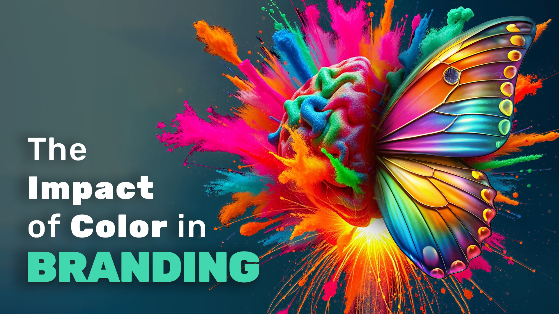
Introduction In the vibrant and competitive world of branding, colour isn’t merely an aesthetic choice; it’s a fundamental element that shapes brand identity and perception. A well-chosen color palette can make a brand instantly recognisable, evoking specific emotions and associations that resonate deeply with its audience. For businesses looking to stand out in a crowded market like Mumbai, understanding the power of colour is essential. This is where a top branding agency in Mumbai comes into play, expertly guiding brands through the nuances of colour psychology to create logos that are not only visually appealing but also deeply meaningful. Mumbai, as the commercial capital of India, is home to a myriad of businesses ranging from startups to multinational corporations. In such a dynamic environment, having a logo that effectively communicates your brand’s values and personality is crucial. A professional branding agency in Mumbai understands the local market, cultural nuances, and global trends, ensuring that your brand’s logo is not just a design, but a strategic tool for success. In this article, we will explore how some of the world’s most iconic brands have leveraged specific color combinations to create lasting impressions. We’ll also discuss how a branding agency in Mumbai can help businesses select the perfect colours to represent their brand, ensuring that they stand out in a city known for its diversity and vibrancy. The Impact of Color in Branding Color plays a pivotal role in branding, influencing not only how a brand is perceived but also how it is remembered. Research has shown that colors can increase brand recognition by up to 80%, making it a critical element in logo design. When choosing colors for a logo, it’s important to consider the emotions and associations that different colors evoke. For instance, red is often associated with passion and energy, while blue conveys trust and reliability. A skilled branding agency in Mumbai will use this knowledge to create a color palette that aligns with a brand’s identity and goals. In a bustling metropolis like Mumbai, where consumers are constantly bombarded with visual stimuli, a well-designed logo with a strong color palette can make all the difference. It’s not just about being noticed; it’s about being remembered. A branding agency in Mumbai will work closely with businesses to understand their target audience and the emotions they want to evoke, ensuring that the chosen colors resonate on a deeper level. MR MAGIC’s Top Picks for Logo Colors Color combinations are a crucial aspect of logo design, as they can convey multiple messages simultaneously. Let’s delve into MR MAGIC’s top picks for logo colors, exploring how these combinations have helped some of the world’s most famous brands establish their identity and connect with their audience. Red and Blue: The Timeless Appeal of Pepsi Red: Energetic and Passionate Pepsi’s use of red in its logo is a masterclass in harnessing the energy and excitement that this color evokes. Red is a color that grabs attention and conveys a sense of urgency, making it perfect for a brand that wants to be seen as dynamic and lively. In a market where Coca-Cola had long dominated with its red-centric logo, Pepsi’s inclusion of red helped maintain its competitive edge by retaining a sense of vibrancy and passion. This energetic hue speaks to the brand’s youthful, spirited audience, creating an emotional connection that goes beyond just a soft drink. Blue: Cool, Fresh, and Trustworthy The introduction of blue into Pepsi’s logo brought a new dimension to the brand’s identity. Blue is often associated with coolness, reliability, and calm, qualities that perfectly complement the brand’s refreshing beverages. In the context of Pepsi, blue not only differentiates the brand from its red-heavy competitor but also adds a layer of trustworthiness. It assures consumers that Pepsi is a brand they can rely on for a refreshing experience, whether they’re quenching their thirst or enjoying a moment of relaxation. Purple and Orange: The Bold Contrast of FedEx Purple: The Color of Trust and Sophistication FedEx’s logo is a study in contrasts, with its bold use of purple and orange creating a dynamic and memorable visual identity. Purple, a color long associated with luxury, creativity, and sophistication, plays a key role in establishing FedEx as a trustworthy and reliable brand. In the logistics industry, where reliability is paramount, the use of purple signals to customers that their packages are in safe hands. This color choice elevates the brand, imbuing it with a sense of professionalism and authority. Orange: The Symbol of Speed and Energy Complementing the purple, orange in the FedEx logo adds a sense of urgency and movement, which is crucial for a delivery service. Orange is a color that conveys enthusiasm, energy, and speed—all qualities that are essential for a brand that promises fast and efficient delivery. The vibrant contrast between purple and orange not only grabs attention but also reinforces the brand’s commitment to speed and reliability. This combination creates a dynamic balance, ensuring that the logo feels both professional and energetic. Orange and Yellow: The Financial Empowerment of MasterCard Red: Life, Courage, and Vitality MasterCard’s logo, with its overlapping red and yellow circles, is a powerful example of how color can convey a brand’s values. The red in the logo represents life, courage, and vitality—qualities that resonate with the brand’s promise of financial empowerment. Red is a color that speaks to the dynamic and active role MasterCard plays in its users’ lives, facilitating commerce, travel, and experiences. This intense and vibrant hue suggests that MasterCard is a tool for those who are ready to take bold steps in their financial journey. Yellow: Happiness and Prosperity Yellow, on the other hand, brings warmth and positivity to the MasterCard logo. Often associated with happiness, optimism, and prosperity, yellow symbolizes the financial security and opportunities that MasterCard provides. It suggests a bright and prosperous future for its users, making the brand approachable and friendly. The interplay between red and yellow creates a sense of balance, with the orange in