PARIS BLOG

HOME > Blog

Blog

Don't Miss Property Update

From Paris Property

Celebrate Diwali: The Festival of Lights with Smart Magic Productions

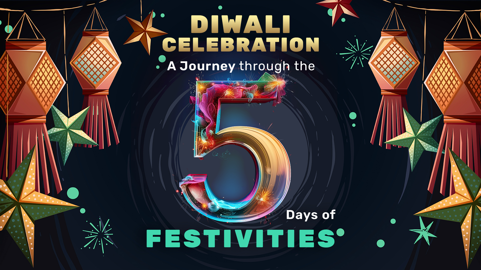
Diwali, also known as the Festival of Lights, is a vibrant and significant celebration that symbolises the victory of light over darkness, knowledge over ignorance, and good over evil. Every year, millions of people across India and the world come together to celebrate this festival, which is filled with joy, unity, and prosperity. At Smart Magic Productions, Diwali holds a deeper significance—it’s not only a time to celebrate but also to reflect on the year of creative growth and innovation that we share with our clients. Much like the glowing diyas that illuminate homes and streets, Smart Magic Productions strives to bring light to every creative project we undertake. Our goal is to ensure that each brand shines brightly, standing out with unique and captivating stories that resonate with the season’s emotions. Inspired by Diwali’s message of renewal and celebration, we create immersive, festive campaigns that capture the essence of the festival and help brands connect with their audience in meaningful ways. Diwali Festival Celebration: A Journey Through the 5 Days of Festivities Diwali is celebrated over five days, each with its own significance and traditions. Let’s explore how each day of Diwali unfolds, and how it brings together families, businesses, and communities in a grand celebration of prosperity and togetherness. Dhanteras: The First Day of Diwali Dhanteras, also known as Dhantrayodashi, marks the beginning of the Diwali celebrations. This day is dedicated to wealth, prosperity, and health. At Smart Magic Productions, Dhanteras reminds us of the importance of creating value in everything we do. Our clients trust us to build prosperous campaigns, and we ensure their brands shine with the brilliance of new ideas and creative designs. Naraka Chaturdashi: Choti Diwali The second day of Diwali is known as Naraka Chaturdashi, or Choti Diwali, which symbolises the victory of good over evil. Much like Choti Diwali’s message of removing negativity, our team at Smart Magic Productions strives to eliminate any creative roadblocks, ensuring that every project reflects positivity and brilliance. Lakshmi Puja: The Main Day of Diwali The third day of Diwali is the most significant and is dedicated to Goddess Lakshmi, who blesses homes with wealth and prosperity. For us at Smart Magic Productions, Lakshmi Puja represents the peak of creative energy. During this festive time, we channel the spirit of Diwali into designing captivating digital experiences, stunning visual campaigns, and innovative advertisements that help brands connect with their audiences in unforgettable ways. Govardhan Puja: Celebrating Lord Krishna The fourth day of Diwali is Govardhan Puja, also known as Annakut, which celebrates Lord Krishna’s triumph over Indra, the god of rain. At Smart Magic Productions, Govardhan Puja reminds us of the importance of loyalty and trust in our relationships with clients. Just like Lord Krishna protected his followers, we are committed to safeguarding and elevating our clients’ brands. Bhai Dooj: A Celebration of Sibling Bonds The final day of Diwali is Bhai Dooj, a day dedicated to celebrating the special bond between brothers and sisters. At Smart Magic Productions, Bhai Dooj reflects the familial ties we build with our clients. We cherish these bonds, knowing that trust and collaboration are the foundations of every successful project. Conclusion Diwali, in all its richness and grandeur, is a celebration of life, joy, and the everlasting pursuit of positivity and growth. From the first spark of Dhanteras to the heartfelt bond of Bhai Dooj, each day of Diwali brings its own set of rituals and significance, painting a vivid picture of tradition, unity, and festivity. At Smart Magic Productions, we draw immense inspiration from these themes, weaving the essence of Diwali into the stories we create and the connections we build. Like the glowing diyas that adorn homes, we strive to illuminate every creative journey, ensuring each project stands out with a unique brilliance that resonates long after the festival lights dim.

Read More »

How to make podcast cover art?

In the bustling world of podcasting, where thousands of shows vie for attention, the importance of a well-designed podcast cover art cannot be overstated. It’s the first thing potential listeners see, often determining whether they hit play or keep scrolling. Just like a book is often judged by its cover, your podcast’s cover art serves as the visual representation of your content, brand, and personality. So, how can you ensure that your podcast cover art not only stands out but also effectively communicates the essence of your show? Let’s explore. Why Podcast Cover Art Matters Your podcast cover art is much more than just a pretty picture. It is a powerful marketing tool that plays a crucial role in the success of your show. Here’s why: Key Elements of Effective Podcast Cover Art Designing impactful podcast cover art involves careful consideration of various elements. Each aspect of the design should work together harmoniously to create a visual identity that resonates with your target audience. Title and Typography The title of your podcast is arguably the most important text on your cover art. It needs to be prominent, clear, and readable even at a glance. Here are a few pointers: Imagery Imagery is a powerful tool in conveying the theme and mood of your podcast. Whether you opt for photographs, illustrations, or abstract graphics, the imagery should be relevant and reflective of your content. Color Scheme Colors play a significant role in making your cover art visually appealing and consistent with your brand. Layout and Composition A well-balanced layout ensures that all elements of your cover art work together harmoniously. Branding Elements Incorporating consistent branding across all aspects of your podcast helps build a recognizable identity. Format and Size Technical specifications are crucial to ensure that your cover art looks great across all platforms and devices. Tips for Designing Podcast Cover Art Creating cover art that stands out requires a combination of creativity, technical skill, and a deep understanding of your audience. Here are some tips to help you along the way: Conclusion Podcast cover art is more than just a decorative element; it’s a critical component of your podcast’s identity and marketing strategy. A well-designed cover can attract new listeners, establish your brand, and convey the essence of your content in a single glance. By focusing on clarity, relevance, consistency, and technical precision, you can create podcast cover art that not only looks great but also works hard for your brand. Whether you’re launching a new show or rebranding an existing one, investing time and effort into your cover art will pay off in the long run, helping your podcast stand out in a crowded marketplace.

Read More »

Understanding Typography in Graphic Design

Understanding Typography is an essential element in the world of graphic design, where the arrangement of text plays a critical role in how a message is conveyed and perceived. While many may overlook typography as merely the selection of fonts, it is, in fact, a comprehensive art and science that profoundly influences the effectiveness of communication through design. Understanding Typography is more than just the selection of typefaces; it encompasses the entire arrangement of text on a page or screen, including the size, spacing, and alignment of characters. In graphic design, typography is pivotal in ensuring that the content is not only legible and readable but also visually appealing, enhancing the overall aesthetic of the design. What is Typography? At its core, typography is the art and technique of arranging type to make written language legible, readable, and visually appealing. It goes beyond mere aesthetics; typography is about how the text is presented to convey meaning effectively. This involves selecting typefaces, point sizes, line lengths, line-spacing (leading), and letter-spacing (tracking), and adjusting the space between pairs of letters (kerning). Understanding Typography is a blend of creativity and precision. A well-executed typographic design can communicate emotions, set a mood, and establish a visual hierarchy, guiding the reader through the content in an intuitive and engaging way. The Importance of Typography in Graphic Design Typography is not just a decorative element in graphic design; it is a fundamental tool for effective communication. The importance of typography can be understood through its impact on various aspects of design: Enhances Readability One of the primary functions of understanding typography is to enhance readability. High contrast between text and background is essential, particularly for users with visual impairments. The psychology of colors also plays a significant role in typography. For example, warm tones can create a friendly and inviting atmosphere, while cooler shades can evoke calmness and professionalism. By carefully selecting colors and typefaces, designers can make the text more accessible and engaging for all users. Sets the Mood and Tone Typography is akin to music in design—it sets the mood and tone of the content. The choice of typefaces, the spacing, and even the alignment of text can influence the visual atmosphere, convey emotions, and establish the overall aesthetic. For instance, a bold, sans-serif typeface might convey strength and modernity, while a delicate script font might evoke elegance and sophistication. By manipulating these elements, designers can create a typographic style that aligns with the message they want to communicate. Establishes Hierarchy In any design, establishing a clear hierarchy is crucial to guide the reader’s eye through the content in the intended order. Typography plays a key role in this process by creating different levels of importance through size, weight, and style. For instance, headings are often larger and bolder to draw attention, while body text is smaller and more uniform to facilitate reading. By organizing text hierarchically, designers can ensure that the most important information is noticed first, followed by supporting details. Reflects Brand Identity Typography is a powerful tool for establishing and reinforcing brand identity. Consistent use of fonts across all brand touchpoints helps build familiarity and trust with the audience. Just as a logo represents the visual identity of a brand, typography represents its voice. For example, a luxury brand might use elegant serif fonts to convey sophistication, while a tech company might opt for a clean, modern sans-serif font to express innovation. The right typographic choices can evoke specific emotions and associations, making them integral to brand communication. Supports Visual Balance The size, weight, and style of typography significantly impact the visual balance of a design. Larger, bolder text naturally attracts more attention and can be used to create focal points, while lighter, more delicate fonts can provide contrast and relief. Proper use of typography can create a harmonious composition that guides the viewer’s eye smoothly across the design, ensuring that no single element overwhelms the others. Key Elements of Typography To fully understand typography’s role in graphic design, it’s essential to delve into its key elements, each contributing to the overall impact of the text. Typefaces and Fonts While often used interchangeably, the terms “typeface” and “font” refer to different concepts in typography. A typeface is a family of related fonts, while a font is a specific set of characters of a particular size, width, and style. For example, Times New Roman is a typeface, while Times New Roman, regular, 12-point, is a font. In graphic design, choosing the right typeface and font is critical to conveying the intended message and maintaining visual consistency across different media. Hierarchy Hierarchy in typography refers to the arrangement and organization of text to indicate its importance. It helps readers navigate the content by distinguishing between headings, subheadings, and body text. This hierarchy is created through variations in text size, color, contrast, and positioning. For instance, in a blog article, the title might be the largest and most prominent text, followed by subheadings in a smaller but still noticeable font, and finally, the body text in a more uniform and understated style. Kerning, Leading, and Tracking These terms refer to the spacing aspects of typography. Kerning is the adjustment of space between individual characters, ensuring that they are evenly spaced and visually pleasing. Leading refers to the space between lines of text, which affects the readability and overall appearance of the text block. Tracking is the overall spacing across a word or passage of text, influencing how open or crowded the text appears. Proper adjustment of these elements can enhance the readability and visual appeal of the text. White Space White space, or negative space, is the area around text and images that is left unmarked. While often overlooked, white space is a critical component of typography that helps to prevent a design from feeling cluttered. It makes the text easier to read and allows the design to “breathe,” creating a more relaxed and comfortable viewing experience. In typography, white space can also

Read More »

Which Colour Logo Attracts The Most? Navratri Colours Edition

In the world of branding, colour plays an undeniable role in shaping a brands  identity, evoking emotions, and influencing consumer behaviour. When it comes to festivals, colours take on greater significance, with each hue carrying cultural, emotional, and psychological meaning. Navratri colours , a vibrant nine-day Hindu festival dedicated to the goddess Durga, celebrates nine different colours, each symbolising a distinct virtue. These Navratri colours are not only spiritually meaningful but also find applications in modern branding strategies, where they help shape the visual language of brands. Yellow: Symbolising Happiness and Optimism The colour yellow is associated with positivity, energy, and joy. During Navratri, this colour is worn on the first day to invoke blessings of happiness and prosperity. In branding, yellow creates a sense of optimism and warmth that resonates with consumers, making them feel more inclined to trust and engage with a brand. One prime example of yellow’s effectiveness in branding is Snapchat. This social media platform exudes happiness and optimism through its design and functionality. By focusing on lasting content—posts that disappear after 24 hours—Snapchat encourages users to capture and share moments without the pressure of perfection. Additionally, Snapchat’s dedication to personal connections—prioritising close friends over a wide audience—creates an environment of warmth and intimacy. Incorporating yellow into branding can thus foster a sense of joy and connection. It invites consumers to engage with a brand in a carefree, joyful manner, much like the celebration of happiness on the first day of Navratri. Green: Representing Growth and Prosperity Green is the colour of life, renewal, and growth. On the second day of Navratri, people adorn green to seek blessings for personal and professional growth. Similarly, in the corporate world, green symbolises vitality, prosperity, and success, making it a popular choice for brands that align with health, well-being, and sustainability. Which can evoke a sense of renewed energy. Tropicana, a brand synonymous with fresh, healthy fruit products, embodies this idea of growth and prosperity. Tropicana’s branding focuses on nature, wellness, and the idea of thriving through balanced nutrition. The brand’s emphasis on fresh-squeezed juices evokes an image of natural energy and vitality, which appeals to health-conscious consumers. Moreover, its vibrant green imagery suggests not only the freshness of the product but also the idea of continuous growth and flourishing. This aligns with the larger cultural theme of seeking prosperity and well-being, as seen on the second day of Navratri. Incorporating green in brand logos and marketing materials can, therefore, symbolize a commitment to growth—both for the brand and for its consumers. Grey: Representing Balance and Roundedness Grey, while often understated, conveys a sense of balance, neutrality, and reliability. It may seem like a simple colour, but it has profound implications for a brand’s image, particularly for companies that wish to appear balanced and grounded in their approach. An example is Wikipedia, the world’s largest online encyclopedia. With its neutral and factual tone, Wikipedia fosters a balanced emotional environment where users can explore diverse viewpoints and information. Grey, as a dominant color in its logo and interface, reflects the platform’s commitment to presenting knowledge in an unbiased, objective manner. By doing so, Wikipedia remains grounded in its mission of providing reliable, accessible information to all, much like the third day’s Navratri color that keeps one emotionally grounded and humble. For brands, grey can convey a sense of authority, neutrality, and calm. It assures consumers that the brand is trustworthy and stable—a grounded presence in a fast-moving world. Orange: Standing for Warmth and Enthusiasm Orange is the color of warmth, energy, and enthusiasm. In the context of Navratri, orange represents courage and confidence, aligning with themes of empowerment. Brands that use orange in their identity often want to inspire excitement, creativity, and a sense of warmth among their consumers. A brand that captures the essence of orange is Dunkin’. Known for its coffee and quick-service breakfasts, Dunkin’ creates an inviting and energetic atmosphere. Its bright orange and pink branding welcomes customers with warmth, while its focus on energising products like coffee reflects enthusiasm and excitement. Dunkin’s fast, friendly service adds to the overall sense of positivity and vigor. Much like the energising hue of orange on the fourth day of Navratri, Dunkin’ encourages customers to start their day with warmth and excitement. Incorporating orange into branding can invoke feelings of friendliness, energy, and enthusiasm, creating a positive and lively brand experience. White: Denoting Peace and Purity White is a symbol of peace, purity, and serenity. In Navratri, the color white is worn to invoke inner peace and clarity of mind. Similarly, brands that utilize white in their logos often aim to project an image of purity, elegance, and simplicity. Chanel, the iconic luxury fashion brand, is a prime example of how white can convey elegance and purity. Chanel’s minimalist designs, featuring clean lines and timeless silhouettes, evoke a sense of grace and serenity. The brand’s dedication to craftsmanship and understated luxury aligns with the purity and peace symbolised by white. Chanel’s branding reflects a deep sense of sophistication, much like the inner peace sought on the fifth day of Navratri. White in branding can, therefore, represent simplicity, peace, and purity, aligning the brand with values of clarity and refinement. Red: Symbolising Strength, Love, and Passion Red is a powerful colour, representing strength, love, and passion. In Navratri, red is worn on the sixth day to embody courage and passion. Brands that use red in their logos often aim to evoke strong emotions, capturing attention and encouraging action. H&M exemplifies the power of red in branding. As a global fashion retailer, H&M blends bold, trendy designs with accessible prices, making fashion available to a broad audience. The brand’s commitment to sustainability and ethical practices adds to its sense of passion for positive change. H&M’s emphasis on self-expression through fashion fosters a deep connection with its customers, inspiring creativity and individuality. This reflects the qualities of strength and passion that are celebrated on the sixth day of Navratri. Red in branding can

Read More »

Famous Logos And their Colour Combinations- Complete Guide

Introduction In the vibrant and competitive world of branding, colour isn’t merely an aesthetic choice; it’s a fundamental element that shapes brand identity and perception. A well-chosen color palette can make a brand instantly recognisable, evoking specific emotions and associations that resonate deeply with its audience. For businesses looking to stand out in a crowded market like Mumbai, understanding the power of colour is essential. This is where a top branding agency in Mumbai comes into play, expertly guiding brands through the nuances of colour psychology to create logos that are not only visually appealing but also deeply meaningful. Mumbai, as the commercial capital of India, is home to a myriad of businesses ranging from startups to multinational corporations. In such a dynamic environment, having a logo that effectively communicates your brand’s values and personality is crucial. A professional branding agency in Mumbai understands the local market, cultural nuances, and global trends, ensuring that your brand’s logo is not just a design, but a strategic tool for success. In this article, we will explore how some of the world’s most iconic brands have leveraged specific color combinations to create lasting impressions. We’ll also discuss how a branding agency in Mumbai can help businesses select the perfect colours to represent their brand, ensuring that they stand out in a city known for its diversity and vibrancy. The Impact of Color in Branding Color plays a pivotal role in branding, influencing not only how a brand is perceived but also how it is remembered. Research has shown that colors can increase brand recognition by up to 80%, making it a critical element in logo design. When choosing colors for a logo, it’s important to consider the emotions and associations that different colors evoke. For instance, red is often associated with passion and energy, while blue conveys trust and reliability. A skilled branding agency in Mumbai will use this knowledge to create a color palette that aligns with a brand’s identity and goals. In a bustling metropolis like Mumbai, where consumers are constantly bombarded with visual stimuli, a well-designed logo with a strong color palette can make all the difference. It’s not just about being noticed; it’s about being remembered. A branding agency in Mumbai will work closely with businesses to understand their target audience and the emotions they want to evoke, ensuring that the chosen colors resonate on a deeper level. MR MAGIC’s Top Picks for Logo Colors Color combinations are a crucial aspect of logo design, as they can convey multiple messages simultaneously. Let’s delve into MR MAGIC’s top picks for logo colors, exploring how these combinations have helped some of the world’s most famous brands establish their identity and connect with their audience. Red and Blue: The Timeless Appeal of Pepsi Red: Energetic and Passionate Pepsi’s use of red in its logo is a masterclass in harnessing the energy and excitement that this color evokes. Red is a color that grabs attention and conveys a sense of urgency, making it perfect for a brand that wants to be seen as dynamic and lively. In a market where Coca-Cola had long dominated with its red-centric logo, Pepsi’s inclusion of red helped maintain its competitive edge by retaining a sense of vibrancy and passion. This energetic hue speaks to the brand’s youthful, spirited audience, creating an emotional connection that goes beyond just a soft drink. Blue: Cool, Fresh, and Trustworthy The introduction of blue into Pepsi’s logo brought a new dimension to the brand’s identity. Blue is often associated with coolness, reliability, and calm, qualities that perfectly complement the brand’s refreshing beverages. In the context of Pepsi, blue not only differentiates the brand from its red-heavy competitor but also adds a layer of trustworthiness. It assures consumers that Pepsi is a brand they can rely on for a refreshing experience, whether they’re quenching their thirst or enjoying a moment of relaxation. Purple and Orange: The Bold Contrast of FedEx Purple: The Color of Trust and Sophistication FedEx’s logo is a study in contrasts, with its bold use of purple and orange creating a dynamic and memorable visual identity. Purple, a color long associated with luxury, creativity, and sophistication, plays a key role in establishing FedEx as a trustworthy and reliable brand. In the logistics industry, where reliability is paramount, the use of purple signals to customers that their packages are in safe hands. This color choice elevates the brand, imbuing it with a sense of professionalism and authority. Orange: The Symbol of Speed and Energy Complementing the purple, orange in the FedEx logo adds a sense of urgency and movement, which is crucial for a delivery service. Orange is a color that conveys enthusiasm, energy, and speed—all qualities that are essential for a brand that promises fast and efficient delivery. The vibrant contrast between purple and orange not only grabs attention but also reinforces the brand’s commitment to speed and reliability. This combination creates a dynamic balance, ensuring that the logo feels both professional and energetic. Orange and Yellow: The Financial Empowerment of MasterCard Red: Life, Courage, and Vitality MasterCard’s logo, with its overlapping red and yellow circles, is a powerful example of how color can convey a brand’s values. The red in the logo represents life, courage, and vitality—qualities that resonate with the brand’s promise of financial empowerment. Red is a color that speaks to the dynamic and active role MasterCard plays in its users’ lives, facilitating commerce, travel, and experiences. This intense and vibrant hue suggests that MasterCard is a tool for those who are ready to take bold steps in their financial journey. Yellow: Happiness and Prosperity Yellow, on the other hand, brings warmth and positivity to the MasterCard logo. Often associated with happiness, optimism, and prosperity, yellow symbolizes the financial security and opportunities that MasterCard provides. It suggests a bright and prosperous future for its users, making the brand approachable and friendly. The interplay between red and yellow creates a sense of balance, with the orange in

Read More »

What are the corporate video categories?

Understanding Corporate Videos: An Essential Tool for Modern Businesses Corporate videos are a versatile and powerful tool for businesses, designed to communicate their brand, products, services, and messages to various audiences. Whether aimed at customers, employees, or stakeholders, Video helps us navigate and communicate our thoughts to the audience.  They are instrumental in building brand identity, enhancing customer relationships, and effectively conveying a company’s values and objectives. Types of Corporate Videos Corporate videos come in different forms, each tailored to specific needs and audiences. Below is an overview of the most common types of corporate videos and their key features: Company Profile Video A company profile video offers a to the point yet compelling overview of a business. This video introduces the company to potential clients, partners, and stakeholders.  Lets look at some Key Features: Explainer Video An explainer video breaks down complex concepts, processes, or products into clear, easy-to-understand content. These videos often use animation or simple visuals to make the message more accessible. Key Features: Promotional Video A promotional video is designed to showcase a company’s products, services, or brand to attract potential customers and enhance brand visibility. It’s an effective tool for generating interest and driving engagement.  Key Features: Compelling Hook: Captures attention quickly with a bold statement or striking visuals. Testimonial Video Testimonial videos feature satisfied clients or employees sharing their positive experiences with the company. These videos build trust and credibility by showcasing real-life stories. Key Features: Recruitment Video Recruitment videos are used to attract top talent by showcasing the company’s culture, work environment, and career opportunities. These videos are essential for engaging potential employees and encouraging applications. Key Features: Event Recap Video Event recap videos summarize the key moments and highlights of a corporate event. These videos are used to showcase the success of the event and promote future participation. Key Features: Internal Communication Video Internal communication videos are used to share important updates, announcements, or training materials within a company. These videos help ensure that all employees are informed and aligned with the company’s goals. Key Features: Training Video Training videos are essential for educating employees on new systems, processes, or policies. These videos help standardize training across the organization and ensure consistency. Key Features: Financial Results Video Financial results videos provide a visual summary of a company’s financial performance. These videos are used to communicate important financial metrics and projections to stakeholders. Key Features: Corporate Social Responsibility (CSR) Video CSR videos highlight a company’s commitment to social and environmental responsibility. These videos showcase initiatives that demonstrate the company’s dedication to making a positive impact. Key Features: Conclusion Corporate videos are an indispensable tool in modern business communication. From promoting products and services to training employees and sharing financial results, these videos help companies engage their audiences, build trust, and effectively convey their messages. By understanding the different types of corporate videos and their unique features, businesses can create compelling content that aligns with their goals and resonates with their target audience.

Read More »

How to brand your business effectively? Learn now

In the competitive world of business, effective branding is more crucial than ever. Your brand is the face of your company and the key to building a loyal customer base. This guide talks about the effective branding strategies that promise to transform your business and give it the edge it needs to thrive. Let’s uncover these strategies that will help you create a powerful brand identity. Understanding the Importance of Branding Branding goes beyond just a logo or a catchy tagline. It encompasses your entire identity as a business and how you communicate your values to your audience. A strong brand differentiates you from competitors and fosters loyalty among customers. Effective branding creates a lasting impression, influencing how people perceive your company. It can turn first-time buyers into repeat customers and even brand advocates who promote your business through word-of-mouth. Know Your Audience One of the most critical aspects of branding is understanding your audience. Who are they? What do they value? Where do they spend their time? By answering these questions, you can tailor your brand to meet their needs and preferences. Conduct thorough market research to gather data about your audience’s demographics, interests, and behaviours. Use surveys, social media analytics, and customer feedback to create detailed buyer personas, which are fictional representations of your ideal customers. For instance, if your audience consists of young professionals interested in eco-friendly products, your branding efforts should reflect sustainability and innovation. Aligning your brand’s values with those of your audience will foster a deeper connection and loyalty. Weave a Unique Brand Story Every brand has a story, and it’s this narrative that can set you apart from competitors. A compelling brand story should convey your company’s mission, vision, and values. It should resonate emotionally with your audience and make them feel a part of your journey. Crafting a unique brand story involves reflecting on your brand’s origins, challenges, and triumphs. What inspired the creation of your company? What obstacles have you overcome? How has your brand evolved over time? For example, if your brand started as a small family business, highlight the tradition, craftsmanship, and personal touch that go into your products. By sharing authentic stories, you humanize your brand, making it more relatable and memorable. Develop a Consistent Visual Identity Consistency is key in branding, and nowhere is this more important than in your visual identity. This includes your logo, color scheme, typography, and overall design aesthetic. A consistent visual identity helps build recognition and trust among your audience. Start by designing a logo that reflects your brand’s personality and values. Choose colors and fonts that evoke the right emotions and ensure they are used consistently across all your marketing materials, from your website to your social media profiles. Create brand guidelines that outline how these visual elements should be used. This ensures that everyone in your organization adheres to the same standards, maintaining a cohesive brand image. Remember, a strong visual identity not only makes your brand recognizable but also reinforces your brand message. Engage on Social Media Social media is a powerful tool for branding. It allows you to connect with your audience on a personal level, share your brand story, and showcase your products or services. However, it’s not just about being present on social media; it’s about engaging effectively. To engage your audience, post content that is relevant and valuable to them. This could be behind-the-scenes looks at your company, customer testimonials, industry news, or entertaining posts that align with your brand voice. Use visuals, such as images and videos, to make your posts more engaging and shareable. Interaction is crucial. Respond to comments, answer questions, and engage in conversations. Show your audience that you value their input and are attentive to their needs. Building a strong social media presence takes time and effort, but the rewards in terms of brand loyalty and customer engagement are well worth it. Leverage Content Marketing Content marketing is an excellent way to establish your brand as an authority in your industry. By creating valuable, informative content, you can attract and engage your target audience, building trust and credibility. Develop a content strategy that aligns with your brand’s goals and audience’s needs. This could include blog posts, videos, infographics, podcasts, and more. Focus on providing solutions to your audience’s problems and answering their questions. For example, if you run a health and wellness brand, create content that offers tips on healthy living, nutrition advice, and workout routines. This not only positions your brand as a knowledgeable resource but also keeps your audience engaged and coming back for more. Utilize Influencer Marketing Influencer marketing can significantly boost your brand’s visibility and credibility. Collaborating with influencers who align with your brand’s values and have a loyal following can help you reach a broader audience and gain their trust. Choose influencers whose audience matches your target demographic. This ensures that your message reaches the right people and has a greater impact. Work with influencers to create authentic, engaging content that showcases your brand in a positive light. For instance, a beauty brand might collaborate with a popular beauty vlogger to demonstrate the benefits of their products. This not only increases brand awareness but also provides social proof, as people tend to trust recommendations from influencers they follow. Focus on Customer Experience Customer experience plays a crucial role in branding. A positive experience can turn customers into loyal advocates, while a negative one can damage your reputation. Ensure that every interaction with your brand, from browsing your website to receiving your product, is seamless and enjoyable. Train your customer service team to handle inquiries and complaints professionally and promptly. Use feedback to continuously improve your products and services. Personalize your interactions with customers to make them feel valued and appreciated. For example, sending personalised thank-you notes or offering exclusive discounts to loyal customers can go a long way in building a positive relationship. Happy customers are more likely to recommend your brand to others,

Read More »

What Are The Most Common Type Of Photography?”

What do you mean by photography? Photography is a versatile and expansive art form that offers endless opportunities for creativity and expression. From capturing the fleeting moments of everyday life to creating meticulously planned compositions, photography encompasses a wide range of genres and techniques. In this article, we will understand  into the different types of photography, highlighting their unique characteristics and the skills required to excel in each genre. Introduction Photography is more than just pointing a camera and pressing a button; it’s about capturing a moment, telling a story, and evoking emotions. With advancements in technology and the proliferation of cameras and smartphones, photography has become accessible to everyone. However, mastering the art requires an understanding of the different types of photography and the techniques involved. Whether you’re an aspiring photographer or a seasoned professional looking to expand your repertoire, exploring various photography styles can enhance your skills and open new creative avenues. Portrait Photography Portrait photography focuses on capturing the essence of a person or group of people. It involves creating a compelling image that reveals the subject’s personality, mood, and emotions. This type of photography often requires a good understanding of lighting, posing, and composition. Portrait photographers may work in studios or on location, and their subjects can range from family members and friends to professional models and public figures. Techniques such as using natural light, employing creative backgrounds, and experimenting with angles can significantly impact the final image. Landscape Photography Landscape photography is the art of capturing the beauty of the natural world. This genre often requires patience, an eye for detail, and the ability to work with different lighting conditions. Landscape photographers aim to convey the grandeur of vast scenes, from majestic mountains and serene lakes to expansive deserts and lush forests. Essential techniques include using wide-angle lenses to capture expansive views, employing the rule of thirds for balanced compositions, and taking advantage of the golden hour (the period shortly after sunrise or before sunset) for optimal lighting. Wildlife Photography Wildlife photography involves capturing images of animals in their natural habitats. This type of photography requires a deep understanding of animal behavior, patience, and quick reflexes. Wildlife photographers often use telephoto lenses to get close-up shots of animals without disturbing them. They also need to be mindful of ethical considerations, ensuring they do not harm or stress the animals. Techniques such as using camouflage, understanding the best times for wildlife activity, and mastering the art of silent movement can enhance the chances of capturing stunning wildlife images. Street Photography Street photography is about capturing candid moments of everyday life in public places. It focuses on documenting human interactions, urban environments, and the spontaneous beauty found in the mundane. Street photographers must be observant, quick on their feet, and respectful of their subjects. This genre often involves working with available light and making quick decisions about composition and framing. Techniques such as zone focusing (pre-focusing the camera to a specific distance) and using small, unobtrusive cameras can help in capturing genuine, unposed moments. Event Photography Event photography encompasses capturing the essence and highlights of events such as weddings, parties, concerts, and corporate gatherings. Event photographers need to be skilled in working with varying lighting conditions, capturing candid and posed shots, and being unobtrusive yet attentive. They often need to anticipate key moments and be ready to capture them as they happen. Techniques such as using flash effectively, understanding the flow of events, and building rapport with clients can contribute to successful event photography. Macro Photography Macro photography involves capturing extreme close-up images of small subjects, revealing intricate details that are often invisible to the naked eye. This genre requires specialised equipment such as macro lenses and extension tubes. Macro photographers must have a keen eye for detail, steady hands, and patience. They often work with small apertures to achieve a deep depth of field and use techniques like focus stacking (combining multiple images with different focus points) to ensure sharpness throughout the image. Fashion Photography Fashion photography focuses on showcasing clothing, accessories, and other fashion items in a visually appealing way. This genre often involves working with models, stylists, makeup artists, and designers to create striking images that highlight the fashion elements. Fashion photographers need to be creative, have a good understanding of lighting and composition, and stay updated with current trends. Techniques such as using studio lighting, experimenting with different angles and poses, and post-processing to enhance colors and textures are essential in fashion photography. Architectural Photography Architectural photography involves capturing the design and aesthetics of buildings and other structures. This type of photography requires an understanding of perspective, lines, and angles to create images that accurately represent the architecture. Architectural photographers often use wide-angle lenses to capture entire buildings and may employ techniques such as HDR (high dynamic range) to balance exposure in challenging lighting conditions. Understanding how to use natural light and shadows can also enhance the visual impact of architectural photographs. Sports Photography Sports photography is all about capturing the intensity, action, and emotion of athletic events. This genre requires quick reflexes, a good understanding of the sport being photographed, and the ability to anticipate key moments. Sports photographers often use fast shutter speeds to freeze action and telephoto lenses to get close to the action. Techniques such as panning (moving the camera to follow a moving subject) and using burst mode (taking multiple shots in quick succession) can help in capturing dynamic sports images. Product Photography Product photography is a crucial aspect of showcasing items for ecommerce and advertising. It involves capturing images that highlight the features, quality, and appeal of a product to attract potential buyers. Effective product photography requires attention to detail, proper lighting, and thoughtful composition to ensure the product stands out. By using techniques such as controlled lighting, clean backgrounds, and creative angles, photographers can create visually appealing images that accurately represent the product and entice customers to make a purchase. Investing in high-quality product photography

Read More »

What are some tips for social media success?

In today’s digital era, socialmedia has emerged as a vital tool for both businesses and individuals. With billions of active users across multiple platforms, effectively leveraging socialmedia can significantly elevate your brand. However, achieving success on socialmedia involves more than just frequent posting. It necessitates a profound understanding of your audience, the creation of high-quality content, and meticulous strategic planning. This comprehensive guide will help you master socialmedia and harness its full potential. Tip 1: Understanding Your Audience Research and Define The foundation of any successful socialmedia strategy is knowing your audience. Conducting thorough research to identify the demographics, interests, and behaviors of your target audience is crucial. Tools like Facebook Audience Insights and Google Analytics can provide valuable data about your audience’s preferences and habits. Engage Actively Building a community around your brand requires active engagement. Responding to comments, messages, and mentions promptly shows your audience that you value their input and fosters a sense of loyalty. Regular interaction not only boosts your visibility but also humanizes your brand, making it more relatable and approachable. Tip 2: Creating Quality Content Visual Appeal In the visually-driven world of socialmedia, high-quality images, videos, and infographics are essential. Eye-catching visuals not only attract attention but also enhance the overall aesthetic of your profile. Investing in good photography and design tools can make a significant difference in how your content is perceived. Consistent Posting Maintaining a regular posting schedule keeps your audience engaged and informed. Consistency is key to staying top-of-mind with your followers. Utilize tools like Buffer or Hootsuite to schedule your posts in advance and ensure a steady flow of content. Storytelling Crafting compelling narratives that align with your brand’s values and mission can create a deeper connection with your audience. Storytelling is a powerful tool that can convey your brand’s personality and message in a relatable and engaging way. Tip 3: Leveraging Analytics Monitor Performance Utilizing analytics tools such as Google Analytics, Facebook Insights, and Twitter Analytics allows you to monitor the performance of your posts and campaigns. These tools provide valuable insights into what works and what doesn’t, helping you refine your strategy. Optimize Strategy Based on the data gathered from analytics, adjust your content and posting strategy to optimize performance. Experiment with different types of content, posting times, and engagement tactics to see what resonates best with your audience. Tip 4: Collaborating with Influencers Identify Relevant Influencers Influencer marketing can significantly boost your reach and credibility. Identify influencers who align with your brand values and have a genuine connection with their followers. Tools like BuzzSumo and Followerwonk can help you find the right influencers for your brand. Build Partnerships Collaborating with influencers to create authentic content can broaden your reach and enhance your brand’s reputation. Establish mutually beneficial partnerships where both parties gain value, ensuring that the collaboration feels organic and trustworthy. Tip 5: Tailoring Content to Each Platform Platform-Specific Strategies Each socialmedia platform has its unique features and audience. Tailor your content to fit the platform you are using. For instance, professional updates are well-suited for LinkedIn, while visual content thrives on Instagram. Use Platform Features Take advantage of platform-specific features like Instagram Stories, Twitter polls, and LinkedIn Articles. Utilizing these features can increase engagement and make your content more interactive and engaging. Tip 6: Role of SEO  Enhanced Visibility and Reach:SEO in social media is crucial for enhancing visibility and expanding reach. By optimising your social media profiles, posts, and content with relevant keywords and hashtags, you increase the chances of your content being discovered by your target audience. This not only improves organic search rankings but also boosts the likelihood of your social media content appearing in search engine results. Leveraging SEO practices on social platforms helps you connect with users who are actively searching for content related to your brand, thereby driving more traffic and engagement. Building Brand Authority and Credibility:Incorporating SEO into your social media strategy also strengthens your brand’s authority and credibility. When your social media content is consistently optimized, it aligns with your overall brand messaging and makes it easier for users to find accurate information about your brand. High-quality, optimized content that resonates with your audience can lead to more shares, likes, and comments, signaling to both search engines and users that your brand is a trusted source of information. Over time, this can help establish your brand as an industry leader and improve your overall online presence. Tip 7: Planning and Scheduling Posts Content Calendar Developing a content calendar helps you plan your posts in advance and ensures a consistent posting schedule. A well-structured content calendar can streamline your workflow and ensure that your content aligns with your marketing goals. Scheduling Tools Tools like Buffer, Hootsuite, and Later allow you to schedule your posts and manage your accounts efficiently. These tools provide valuable features such as post analytics, social listening, and team collaboration, making socialmedia management more effective. Tip 8: Engaging in Social Listening Monitor Conversations Social listening involves tracking mentions of your brand and industry-related topics on socialmedia. Tools like Mention and Brandwatch can help you monitor these conversations, providing valuable insights into public perception and emerging trends. Participate Engage in relevant discussions to increase your visibility and establish your brand as an industry leader. By participating in conversations, you can connect with potential customers, gather feedback, and stay informed about industry developments. Tip 9: Hosting Contests and Giveaways Generate Excitement Contests and giveaways are a great way to attract new followers and boost engagement. They create excitement and incentivize your audience to interact with your brand. Make sure the prizes are appealing and relevant to your audience. Clear Rules Ensure that the rules of your contests and giveaways are simple and easy to understand. Clearly communicate how participants can enter and what they stand to win. Transparency in the process builds trust and encourages participation. Tip 10:Staying Updated with Trends Follow Trends Keeping an eye on emerging socialmedia trends can give you a competitive edge. Stay

Read More »

Why graphic design is important for book covers?

Graphic design is an integral part of creating compelling book covers, merging art and marketing to entice potential readers. A well-designed book cover is more than just a protective layer; it’s a visual ambassador of the book’s content, conveying its essence and drawing readers into its world. On Book Lovers Day, we celebrate the power of graphic design in transforming book covers into captivating works of art.  Book covers have come a long way from simple text and plain backgrounds. Modern graphic design techniques allow for intricate illustrations, sophisticated typography, and strategic colour schemes that make book covers not just attractive, but also highly effective in communicating the story within. As we honour Book Lovers Day, it’s the perfect time to delve into the elements and techniques that make graphic design for book covers so essential. Purpose of Graphic Design in Book Covers The primary purpose of graphic design in book covers is to attract potential readers and convey the book’s theme and tone. A visually appealing cover can make a significant difference in whether a book is picked up or passed over. By combining various design elements such as imagery, typography, and color, graphic designers create covers that are not only beautiful but also meaningful and representative of the book’s content. Key Elements of Graphic Design for Book Covers Typography is a critical component of book cover design. It involves selecting fonts and arranging text to make the title and author’s name clear and readable while also complementing the book’s theme. For example, a historical fiction novel might feature elegant, classic fonts, while a sci-fi thriller could use bold, futuristic typography. The choice of fonts, their size, spacing, and placement are all strategic decisions that enhance the overall design. Colors have a profound psychological impact on readers. The right color scheme can evoke specific emotions and set the mood for the book. For instance, warm colors like red and orange can create a sense of excitement and energy, while cool colors like blue and green may evoke calm and mystery. Understanding color theory and how different colors interact is essential for creating a cohesive and appealing book cover. Imagery and illustrations are powerful tools in book cover design. High-quality images and original illustrations can quickly convey the book’s genre, setting, and mood. Whether it’s a detailed illustration for a fantasy novel or a minimalist photograph for a contemporary drama, the choice of imagery is crucial in drawing readers in and sparking their curiosity. The layout and composition of a book cover determine how all the visual elements are arranged. A well-composed cover guides the viewer’s eye through the design in a logical and aesthetically pleasing way. Principles such as balance, contrast, and hierarchy help create a layout that is both engaging and effective. For example, placing the title at the top and using contrasting colors can ensure it stands out and grabs attention. The Process of Designing Book Covers The first step in designing a book cover is to thoroughly understand the book’s content, themes, and target audience. This involves reading the manuscript or a detailed summary and discussing key elements with the author. A deep understanding of the book helps the designer create a cover that accurately reflects its essence. Once the designer has a clear understanding of the book, they begin brainstorming and sketching initial concepts. This phase includes creating mood boards, exploring different styles, and drawing inspiration from various sources. The goal is to develop a unique concept that captures the book’s spirit. After developing initial concepts, the designer creates rough drafts and shares them with the author and other stakeholders for feedback. This iterative process involves multiple revisions to refine the design and ensure it aligns with the author’s vision and appeals to the target audience. In the final stage, the designer polishes the cover, ensuring that all elements—typography, color, imagery, and layout—work harmoniously together. The design is then prepared for print and digital formats, ensuring it meets technical specifications and looks great in various formats. Tools and Software for Book Cover Design Traditional tools like pencils, markers, and sketchpads are often used in the initial stages of concept development. These tools allow designers to quickly capture ideas and explore different possibilities in a tactile way. Digital tools are essential for modern book cover design. Software like Adobe Photoshop, Illustrator, and InDesign are industry standards for creating high-quality designs. These programs offer a wide range of features for editing images, creating vector graphics, and designing layouts. Procreate is another popular tool for digital sketching and painting. Tips for Creating Effective Book Covers Understanding the target audience is crucial for creating a book cover that resonates. The design should reflect the audience’s preferences and expectations. Researching the audience’s interests and the design trends within the book’s genre can provide valuable insights. Book cover design trends evolve over time. Staying updated with current trends can help designers create contemporary and relevant covers. However, it’s also important to balance trendiness with timeless appeal, ensuring the cover remains effective over time. While creativity is essential, clarity should not be compromised. The cover must be visually appealing and convey the book’s message clearly. Striking a balance between artistic expression and readability ensures that the cover serves its purpose effectively. Feedback from clients, peers, and potential readers is invaluable. Constructive criticism helps identify areas for improvement and refine the design. Regularly seeking feedback during the design process can lead to a more polished and effective book cover. Examples of Iconic Book Covers Some classic book covers have become iconic over time. The cover of “The Great Gatsby” by F. Scott Fitzgerald, with its striking illustration of a woman’s face superimposed over a cityscape, captures the novel’s themes of wealth and disillusionment. Its timeless design remains a cultural touchstone. Modern book covers often reflect current design trends and technological advancements. The cover of “The Night Circus” by Erin Morgenstern, featuring a whimsical black-and-white illustration with splashes of red, effectively conveys the

Read More »